BRANDING
Slawa is a premium mineral water brand dedicated to delivering nature’s most refreshing hydration. Sourced from the heart of untouched mountain springs, Slawa represents absolute purity, vitality, and wellness. The brand is designed for discerning consumers who value high-quality, natural products and a clean, healthy lifestyle.
Brand Identity Design, Visual System Development
concept
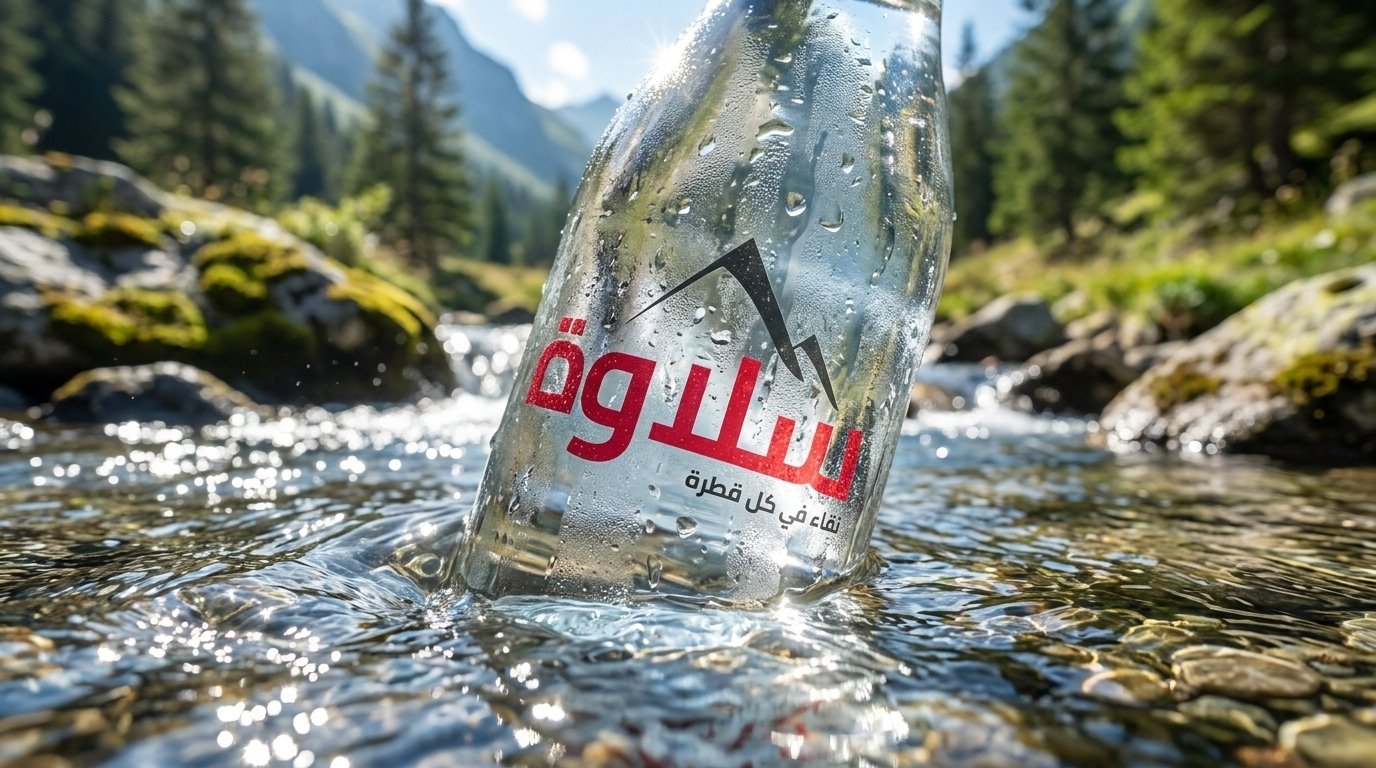
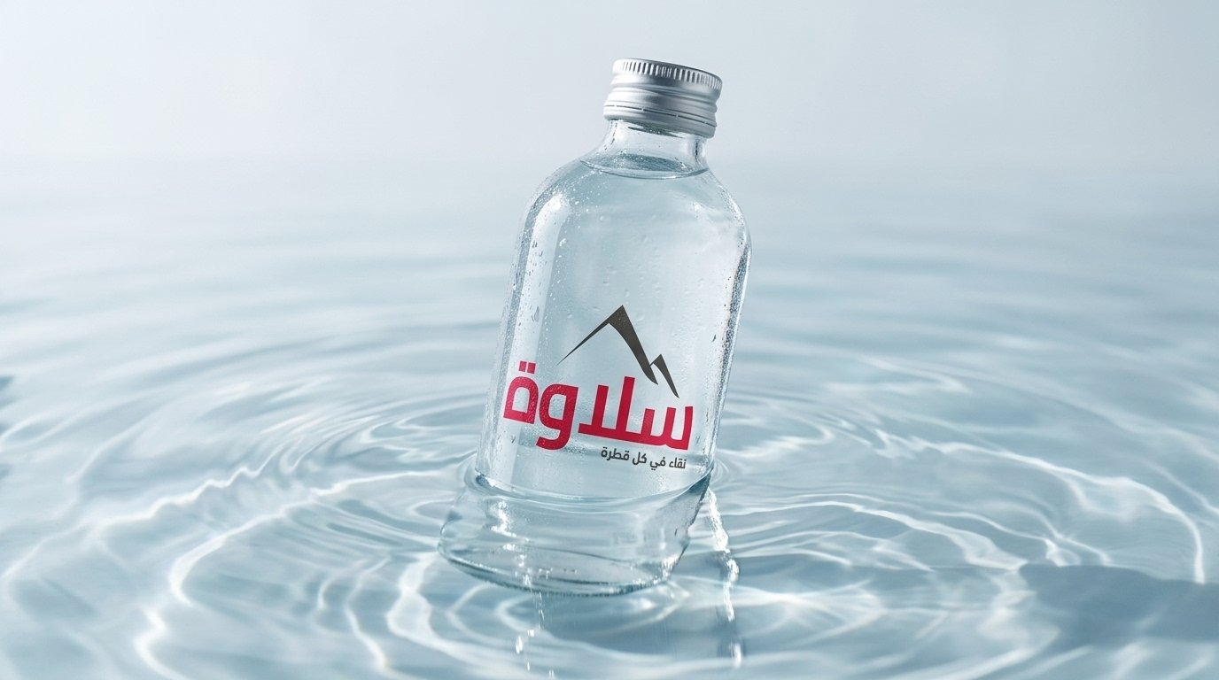
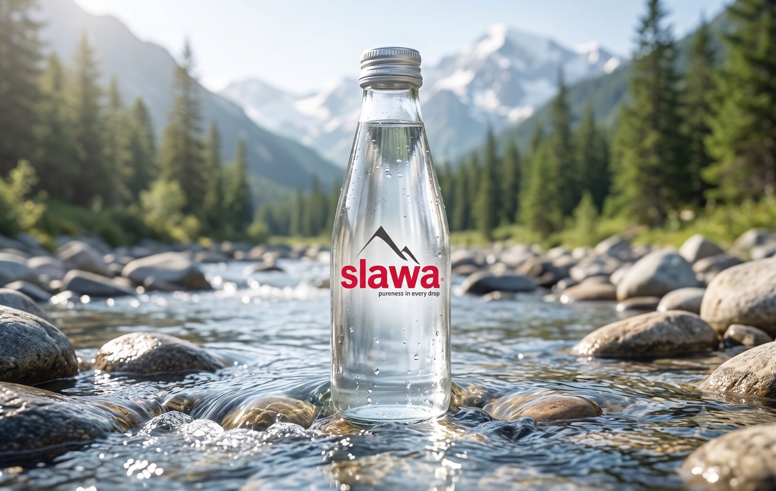
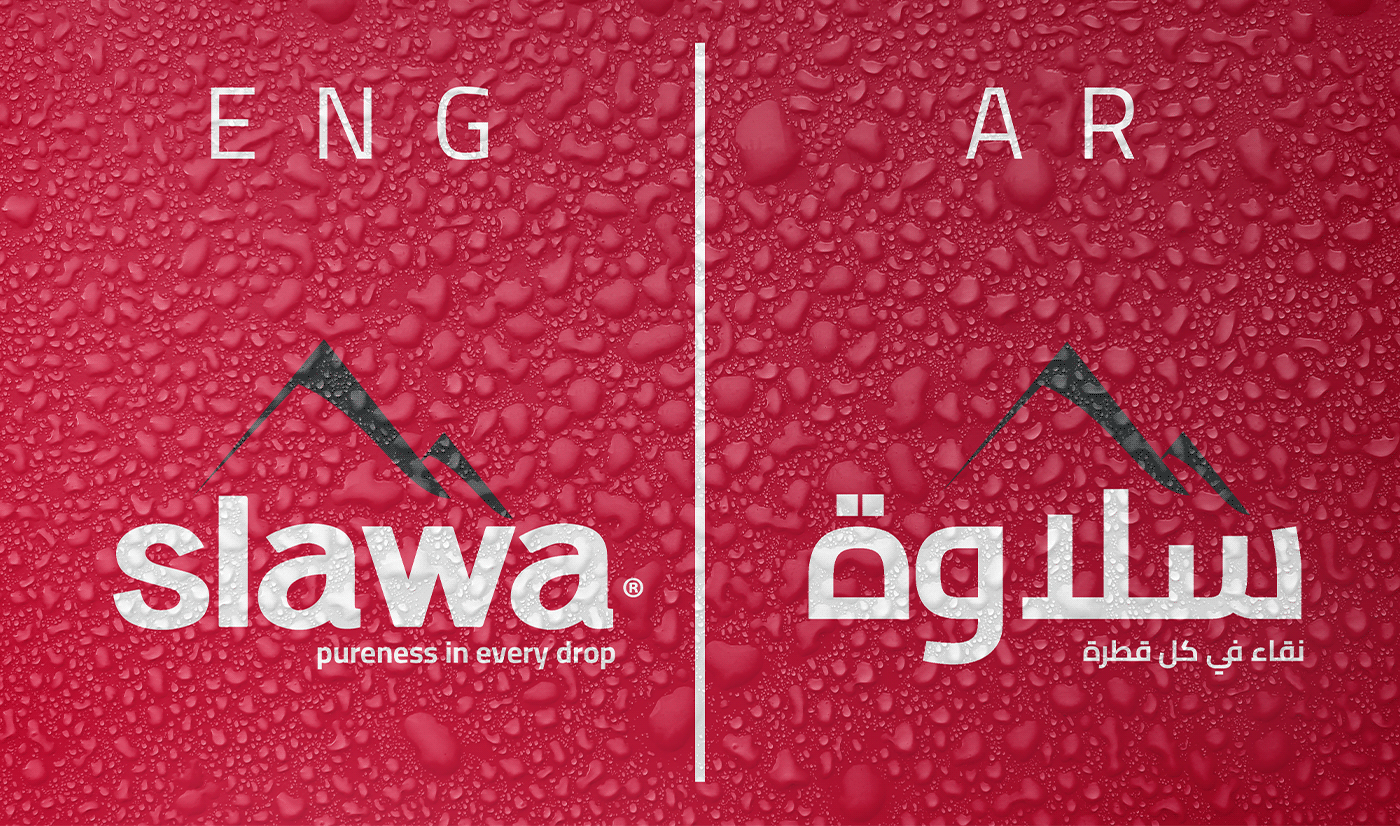
To make Slawa instantly recognizable, the design utilizes a bold, confident color palette. The vibrant red typography (“slawa” / “سلاوة”) conveys life, energy, and vitality, creating a beautiful, striking contrast against the crystal-clear transparency of the water and natural environments.
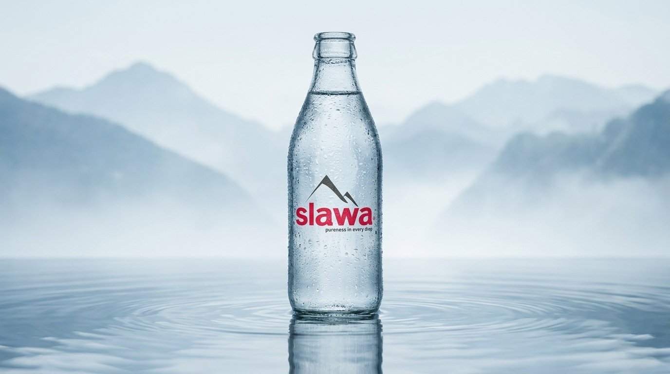
Logo Logic
Anchoring the logo is a sleek, modern mountain peak icon in dark charcoal, serving as a direct visual tribute to the water’s pristine, high-altitude origins. The bilingual typography was meticulously balanced to maintain structural harmony across both English and Arabic markets, unified by the brand’s central promise: “Pureness in every drop” (نقاء في كل قطرة).